

 Worldwide Locations
If your organization has upgraded to Office 2016 or Office 365, you now have access to Excel 2016. Now what? Are there any new features? The answer is yes, especially if you need business intelligence tools and new ways to present your data.
Don’t miss out on new Excel 2016 features. Here are 7 I’m most excited about:
1. The 'Tell Me' Box
The "tell me" box is one of the most obvious new arrivals to the Excel party and, quite frankly, it's a shame it wasn't around in the 2007 edition when the menu ribbon was initially reduced. (Remember how hard it was to find our favorite tools?) The “tell me” box is essentially a search function that lists functions and operations matching your search terms. It’s a handy shortcut to get you where you want to go! There's also smart look-up which will use the internet to search relevant articles for your search term.
2. Forecasting
Excel 2016 has seen the addition of “one-click” statistical forecasting for data that has a time element associated with it. As long as you have a decent amount of data it will be able to forecast past your last data point, as well as show levels of confidence at each end of the spectrum. What's also great about the forecasting function is that if Excel can see trends due to seasonality, it will factor them into the forecast. Pretty smart! Once you've made your forecast you'll be able to display it as either a line or bar graph, but be aware that the data used to create your graph of choice will not link to the chart. If you make changes to the data these will not automatically be reflected in the chart.
3. Search field (PivotTables)
PivotTables have been revitalized with a search bar that makes life easier when dealing with large data sets with numerous fields. Just search for the field you're looking for and it pops up for you to select.
4. Date Grouping (PivotTables)
Previously, Excel PivotTables would always register dates individually—your charts would have hundreds of fields along the date axis. Now dates are automatically grouped into Years, Quarters and Months. If you want to delve deeper you simply use the + option next to the date segment to expand the next level of grouping. I think you’ll find it’s much more manageable.
5. New Chart Types
The people at Microsoft claim that Excel has not seen the addition of a new chart type since the 1997 edition. You know when you’re waiting for the bus, you get none for ages and then loads come along at once—that’s the case with Excel 2016, which unveils six new chart types, each with their own specialist uses. Here are my favorites:
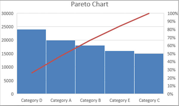
- Histograms and Pareto charts
Histograms show you frequencies (e.g. how much of one product has sold against another). They're not based on categories but on values that are allocated into different bins. If you want to alter this to show categories you can do that. Pareto charts go one step further by sorting these frequencies and adding a cumulative percentage line to give you a trend through the data.

- Sunburst charts
These show values by hierarchy. A good use for sunburst charts would be to analyze sales of a company and break it down by salesperson, customers and products purchased. The chart will plot the sales people at the highest level and size their sections by the sales they have made. The next level will be the customers and the total amount they have spent with their respective salesperson. The final level shows the products bought by each customer. Sunburst charts allow you to go to dozens of levels so you can really drill down into your data.
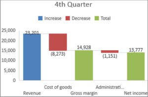
- Waterfall charts
Waterfall charts are great for showing movement from an opening position to a closing position and are therefore ideal for plotting financial data, such as cash flow over a period of time. They show your opening balance, the progression through the various stages of trading and then stop at your closing balance.
- 3D data map
Perhaps the most impressive looking of all the new visualizations in Excel 2016, the 3D data map was actually an add-in for the 2013 version but is now a fully integrated option. This chart is perfect for analyzing data with a global span (e.g. a company sales report where the company operates with a global client base). Obviously you need locational data to use this type of chart and you can then add other fields to build your picture. The chart will give you a map of the world with bars or columns in the locations that have fields attached. What's more, if you set this against a particular period of time the chart will allow you to record a simulation video showing the change in values over that period. It’s great for presenting sales growth to the board or your team.
6. PowerPivot
PowerPivot is still technically an add-in, and not new to Excel, but it's a great tool to use to bring data into Excel. In fact it allows you to import greater levels of data (we're talking hundreds of millions of fields here). PowerPivot even has its own function language, Data Analysis Expression or DAX, and this is where the new features lie. If you feel like you've exhausted all of Excel's functions, have a go with PowerPivots.
7. Get & Transform
Another permanent fixture that started life as the Power Query add-in, Get & Transform helps you import data from various data sources. There are still the standard options of importing from a Comma Separated Values (CSV) file or an Excel workbook but now you can also choose options such as Facebook, Salesforce and other programs and packages. Once you've imported your data it will give you the chance to tidy the data into a useable format. You can also apply the Get & Transform tools to data already in Excel.
To accelerate your Excel 2016 productivity, take a hands-on course from Global Knowledge. Our introductory and intermediate courses are personalized by version, allowing you to choose the one you will use. Our advanced and Power BI courses are specific to version 2016, allowing you to fully exploit its exciting new features.
Related webinars
Advanced Functions of Excel Formulas: Part 1
Advanced Functions of Excel Formulas: Part 2
Related courses
Microsoft Excel- Level 1/ Intro (2010, 2013, 2016)
Microsoft Excel - Level 2 / Med (2010, 2013, 2016)
Microsoft Excel 2016 - Level 3 / Advanced
Microsoft Excel 2016 - Data Analysis with Pivot Tables
Power Pivot and Power Query for Excel 2016
About the author
Denis has been a Microsoft Certified Trainer for over 10 years, teaching Office courses such as Word, Excel, PowerPoint, Access, Outlook and OneNote, as well as Visual Basic programming. He rounds out his application training skills with experience in team building, conflict resolution, time management, and proposal and report writing.
Subscribe
Never miss another article. Sign up for our newsletter.
